Today's postings
- [Baren 40734] Re:Georgina's "extending" woodcut (Margot Rocklen)
- [Baren 40735] Baren Member blogs: Update Notification (Blog Manager)

Message 1
From: Margot Rocklen
Date: Wed, 03 Mar 2010 14:16:49 GMT
Subject: [Baren 40734] Re:Georgina's "extending" woodcut
Send Message: To this poster
The original single black and white woodcut is so strong and evocative. Every line is important to the image.
Extending onto another block seems the solution for you and for the viewer, allowing one to follow along as you
develop your concept. I could see this image eventually growing to mural size, with the option of being able to
display any or all parts.
Margot Rocklen
Digest Appendix
Postings made on [Baren] members' blogs
over the past 24 hours ...
Subject: Havin' fun ... keepin' busy!
Posted by: Dave Bull
|
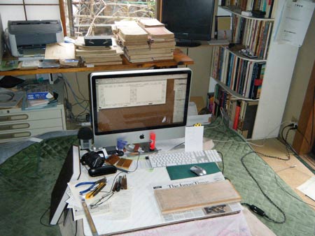
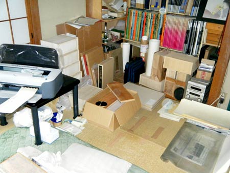
These periods - the overlaps between the end of one print series and the beginning of another one - are 'the best of times, and the worst of times' for me. As much as I would like to kick back and relax after three years of work on the Solitudes print series, the deadline for shipping the first Mystiques print is just over three weeks away, and there's no sitting still! When I came back into my 'office' this afternoon after a nice long bath down at the Post Office, I stood there for a minute looking around, and thought it might be fun to share it with you ... Here are three snapshots (click for enlargements), each one with an accompanying list of things you can hunt for, if you are so inclined! 
Now if we turn around ... 
|
This item is taken from the blog Woodblock RoundTable.
'Reply' to Baren about this item.
Subject: Things you neeb to know about printmaking
Posted by: Pistoles Press
|
Here is an excellent example of a "type demon". I had to laugh out loud when I pulled this first proof. Just a simple matter of slipping that letter out to replace it with the right one but I'm always deathly afraid that I'll get tired and not catch stupid mistakes until I'm on the last print. Thankfully I had two other people in the studio working around me so I bugged them to proof read and suffer through my poetry enough to say there were no more spelling errors. Catherine Moore was working on a really neat project that is somewhat similar to mine in playing with how type is arranged to create mood and flow. I was really fascinated by here set up and it was neat to see that and hear her and Garrett Queen talking about soundscapes. People really do take sound for advantage and everything from pattering rain to the slow rumble of a train down the tracks has its place. Above is a picture of her arrangement of wood type on the VABC Vandercook. Meanwhile, I was neebing all the help I could get. I love my set of Fransiscan Type but I have since learned the valuable lesson that 16pt. font was not common at all. I thought I could borrow some spacing material for this project from the VABC but they never owned a set of 16pt. font so had no reason to ever acquire 16pt. spacing material. Thankfully, Dave Churchman of Sterling Type Foundry was there to save the day and was able to get me some. It wasn't much but my job has been small so far. I still need to find a good way of storing spacing material besides those plastic hardware bins. I HATE those things. In the mean time, my Lichee Black Tea tin now devoid of . . . [Long item has been trimmed at this point. The full blog entry can be viewed here] |
This item is taken from the blog Pistoles Press.
'Reply' to Baren about this item.