Today's postings
- [Baren 40713] Re: New Baren Digest (HTML) V50 #5154 (Feb 28, 2010) re APA (osadchuk nancy)
- [Baren 40714] Re: American Print Alliance (Melissa West)
- [Baren 40715] Just in case ("Dan Dew")
- [Baren 40716] Re: American Print Alliance (aqua4tis # aol.com)
- [Baren 40717] Re: American Print Alliance ("Ellen Shipley")
- [Baren 40718] Re: American Print Alliance (Diana Moll)
- [Baren 40719] RE: New Baren Digest (HTML) V50 #5154 (Feb 28, 2010) (guadalupe Vic)
- [Baren 40720] Re: American Print Alliance (John and Michelle Morrell)
- [Baren 40721] I've joined the baren-tying club (Andrew Stone)
- [Baren 40722] Re: I've joined the baren-tying club (David Bull)
- [Baren 40723] Baren Member blogs: Update Notification (Blog Manager)

Message 1
From: osadchuk nancy
Date: Sun, 28 Feb 2010 20:30:58 GMT
Subject: [Baren 40713] Re: New Baren Digest (HTML) V50 #5154 (Feb 28, 2010) re APA
Send Message: To this poster
Nancy O

Message 2
From: Melissa West
Date: Sun, 28 Feb 2010 22:39:35 GMT
Subject: [Baren 40714] Re: American Print Alliance
Send Message: To this poster
+ + + + + + + + + + + + + + + +
Melissa West
Santa Cruz, CA 95062
www.mswest.com

Message 3
From: "Dan Dew"
Date: Mon, 01 Mar 2010 00:09:31 GMT
Subject: [Baren 40715] Just in case
Send Message: To this poster
http://danieldew.blogspot.com/2010/02/psalm-17.html
Just in case the Blog finder thing misses me. :-)
Daniel L. Dew

Message 4
From: aqua4tis # aol.com
Date: Mon, 01 Mar 2010 02:26:17 GMT
Subject: [Baren 40716] Re: American Print Alliance
Send Message: To this poster
i vote yes as well
georga

Message 5
From: "Ellen Shipley"
Date: Mon, 01 Mar 2010 04:28:35 GMT
Subject: [Baren 40717] Re: American Print Alliance
Send Message: To this poster
Ellen

Message 6
From: Diana Moll
Date: Mon, 01 Mar 2010 04:34:53 GMT
Subject: [Baren 40718] Re: American Print Alliance
Send Message: To this poster
YEs
dmoll

Message 7
From: guadalupe Vic
Date: Mon, 01 Mar 2010 04:58:29 GMT
Subject: [Baren 40719] RE: New Baren Digest (HTML) V50 #5154 (Feb 28, 2010)
Send Message: To this poster
Dear Printmakers: Peace call outside of Baren exchanges.
We are organizing our Third International Prints for Peace México 2010.
Please help us distribute this call to other printmakers.
No participation fee instead of the donation of the print for educational purposes.
Documentation in our web page.
One solo exhibit and one collective exhibit as awards.
Deadline May 15 2010 print should be in Monterrey.
Theme: Peace
Paper size: 10 x 10 inches or 25 x 25 centemeters
Image size: Any size
Technique: Hand pulled printmaking. No glicees, photos or computer art please.
Please look at the complete call in our web page http://www.printsforpeacemexico.blogspot.com/
and or contact me at printspeace@gmail.com.
Dra. Guadalupe Victorica
Tercer Convocatoria Internacional Grabados por la Paz México 2010
Segunda Colectiva Internacional de Grabado 2010
Third International Prints for Peace 2010, Second International Printmaking Collective 2010
http://www.printsforpeacemexico.blogspot.com/
Arte Desarrollo Humano

Message 8
From: John and Michelle Morrell
Date: Mon, 01 Mar 2010 07:21:53 GMT
Subject: [Baren 40720] Re: American Print Alliance
Send Message: To this poster
Michelle Morrell

Message 9
From: Andrew Stone
Date: Mon, 01 Mar 2010 08:47:00 GMT
Subject: [Baren 40721] I've joined the baren-tying club
Send Message: To this poster
I have a Murasaki baren with the purple twisted cord for the coil and I've had it for about two years. But as I've become a bit more aggressive as a printer (I'm using heavier paper, more impressions and colors, pressing heavier. I noted more wear on it recently and a few weeks ago a small hole appeared in the bamboo leaf covering and then a liner split/tear that rendered it unusable. I've had the 5-pack of bamboo skins from the Baren Mall for over a month now so I've really been delaying but tomorrow I want to print some plain color blocks and I couldn't wait any longer as I'll need it for printing.
So I watched the "how to cover the baren" segment on Dave's e-book a couple of more times. Looked at the link too on the Baren blog. Got everything out on the kitchen table.
Small oak block...check;
smooth stone...check; Hemp string....check; damp towel, scissors, check.
ONE slightly damp bamboo leaf. ....check.
I even managed to do it alone with my smallish hands. It didn't come out great but it's serviceable and should print fine. I had a split at the thick end that I managed to cut out just moving the shin down the leaf a bit and recutting the shape. The handle is a bit uneven and pretty ugly but the printing surface is nice and tight and smooth. I doubt it will last as long as the original but now I have an idea and the next time will go faster and better. Even if it's soon.
So, I've finally done it and now I've got one LESS thing to worry about.
Andrew Stone
rospobio.blogspot.com

Message 10
From: David Bull
Date: Mon, 01 Mar 2010 08:59:29 GMT
Subject: [Baren 40722] Re: I've joined the baren-tying club
Send Message: To this poster
> So, I've finally done it and now I've got one LESS thing to worry
> about.
Nice to see these recent posts talking about baren tying!
In recent years, we've kind of let this thing grow into a big 'myth'
that the process is somehow incredibly difficult and 'impossible'.
(I'm at least partly responsible for that I guess ...)
Now that people are finding that it's actually a completely manageable
process - and letting us know! - hopefully one day we'll get to the
point where it becomes 'routine' for us all!
Dave
Digest Appendix
Postings made on [Baren] members' blogs
over the past 24 hours ...
Subject: [Seacoast in Spring - 10] - OK, we're done!
Posted by: Dave Bull
|
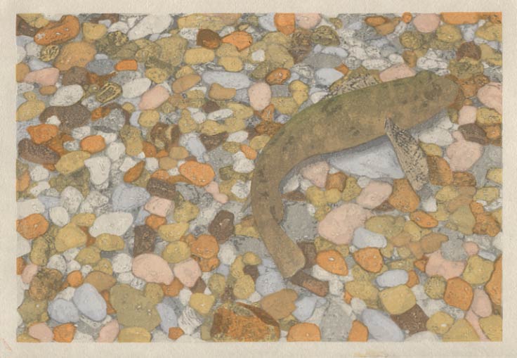
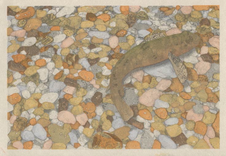
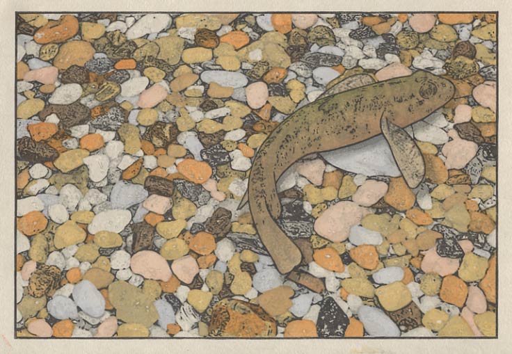
Continued from [Seacoast in Spring - 9] | Starting point of the thread is [Seacoast in Spring - 1]  We got a bit of colour on the fish yesterday, and although that plain grey/brown tone brought us pretty close to what I actually saw that day down at the seashore, I think I'd like to take it a bit further ... 'artistic license', you know! Let's put a touch of colour along his spine:  And a bit of subtle colour on his underside. I have no idea if these colours match anything that would be found on any of the fish in the area where I have been camping, and perhaps the fishermen among you are groaning at this, but there he is ...  And we have one more to finish it off. I have reversed the usual procedure for this printing session - instead of beginning with the keyblock, I decided to hold it back until the end. By doing so, we get an excellent demonstration of just how vividly everything changes when there is a strong key line in place:  "I remember one of the 'lessons' that I learned on the first trips in this series - that if I stop moving for a while, and just sit still, things start to happen. So I plop down in the pool and sit quietly, trying to avoid making waves. My reward comes less than a minute later. Coming into view from 'out of nowhere', a minnow-like little fish - perhaps only about 3 centimetres long - swims into view, poking his nose into the crevices between the little stones on the seabed. He seems completely oblivious to my presence, and swims between my legs, suspended in the completely transparent water. I can't resist the impulse to see what happens when I poke a finger down into the water, and the result is predictable - he simply disappears ... instantly." So there we have it - the last of the 12 prints in this set! I have a lot to talk about yet with this series of prints, and over the next few days, I'll be making some more postings to discuss some of them, but right now this afternoon, there just isn't time for that. I have to get these things dried off and sent out . . . |
This item is taken from the blog Woodblock RoundTable.
'Reply' to Baren about this item.
Subject: Psalm 17
Posted by: Daniel L. Dew
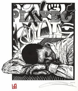
 Well, what would you recommend? Well, what would you recommend?Keep me as the apple of your eye; hide me in the shadow of your wings from the wicked who assail me, I was trying for the impression of him being assailed by the "enemies" of life, but being protected by God and being able to "rest" in that protection. Like my last Psalm, I have decided to keep using paint for the illumination and actual ink for the lettering. Oh yeah, for my printmaking buds, image was carved in lino and printed on 135lb Zerkal Book weight white paper with Graphic Chemical water based black ink. Here is the decorative initial:  I really wish I could get the colors right on these scans and have the gold leaf show up correctly. The colors are right and the intensity is fine, but it makes the gold look horrible. Oh well. I like this color combination. It took me some time, and some experimenting, but eventually decided that it worked. Especially when you see below how the illumination turned out (once again, got the idea at church).  Looks kinda small here, but when you see the final image, it will make sense. It . . . Looks kinda small here, but when you see the final image, it will make sense. It . . .[Long item has been trimmed at this point. The full blog entry can be viewed here] |
This item is taken from the blog A Psalm Quest.
'Reply' to Baren about this item.